
Published - | Updated - June 23, 2021 12:18 am
243 Views

Hi Dev,
Today, i we will show you Bootstrap drag and drop using jquery UI sortable. This article will give you simple example of Bootstrap drag and drop using jquery UI sortable. you will learn Bootstrap drag and drop using jquery UI sortable. So let’s follow few step to create example of Bootstrap drag and drop using jquery UI sortable.
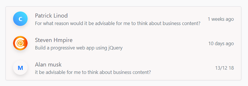
Preview:
Example
<!DOCTYPE html>
<html>
<title>Bootstrap Sort list by drag and drop using jquery UI sortable - Codeplaners.com</title>
<meta name="viewport" content="width=device-width, initial-scale=1">
<link href="https://maxcdn.bootstrapcdn.com/bootstrap/4.0.0/css/bootstrap.min.css" rel="stylesheet">
<script src="https://stackpath.bootstrapcdn.com/bootstrap/4.0.0/js/bootstrap.bundle.min.js"></script>
<script src="https://code.jquery.com/jquery-1.12.4.js"></script>
<script src="https://code.jquery.com/ui/1.12.1/jquery-ui.js"></script>
<script>
    $(function() {
        $("#sortable").sortable();
        $("#sortable").disableSelection();
    });
</script>

<body>

<div class="page-content page-container" id="page-content">
    <div class="container">
        <div class="row">
            <div class="col-sm-12">
                <div class="container-fluid d-flex justify-content-center">
                    <div class="list list-row card" id="sortable" data-sortable-id="0" aria-dropeffect="move">
                        <div class="list-item" data-id="13" data-item-sortable-id="0" draggable="true" role="option" aria-grabbed="false" style="">
                            <div><a href="#" data-abc="true"><span class="w-40 avatar gd-primary">C</span></a></div>
                            <div class="flex"> <a href="#" class="item-author text-color" data-abc="true">Patrick Linod</a>
                                <div class="item-except text-muted text-sm h-1x">For what reason would it be advisable for me to think about business content?</div>
                            </div>
                            <div class="no-wrap">
                                <div class="item-date text-muted text-sm d-none d-md-block">1 weeks ago</div>
                            </div>
                        </div>
                        <div class="list-item" data-id="9" data-item-sortable-id="0" draggable="true" role="option" aria-grabbed="false">
                            <div><a href="#" data-abc="true"><span class="w-40 avatar gd-info"><img src="https://codeplaners.com/wp-content/uploads/2020/09/cropped-favicon-social-192x192.png" alt="."></span></a></div>
                            <div class="flex"> <a href="#" class="item-author text-color" data-abc="true">Steven Hmpire</a>
                                <div class="item-except text-muted text-sm h-1x">Build a progressive web app using jQuery</div>
                            </div>
                            <div class="no-wrap">
                                <div class="item-date text-muted text-sm d-none d-md-block">10 days ago</div>
                            </div>
                        </div>
                        <div class="list-item" data-id="17" data-item-sortable-id="0" draggable="true" role="option" aria-grabbed="false" style="">
                            <div><a href="#" data-abc="true"><span class="w-40 avatar gd-warning">M</span></a></div>
                            <div class="flex"> <a href="#" class="item-author text-color" data-abc="true">Alan musk</a>
                                <div class="item-except text-muted text-sm h-1x">it be advisable for me to think about business content?</div>
                            </div>
                            <div class="no-wrap">
                                <div class="item-date text-muted text-sm d-none d-md-block">13/12 18</div>
                            </div>
                        </div>
                    </div>
                </div>
            </div>
        </div>
    </div>
</div>
<style>
body {
     background-color: #f9f9fa
}
.card {
     background: #faf7f7;
     border-width: 0;
     border-radius: .25rem;
     box-shadow: 0 1px 3px rgba(0, 0, 0, .05);
     margin-bottom: 1.5rem;
	 margin: 50px 0 0;
     position: relative;
     display: flex;
     flex-direction: column;
     min-width: 0;
     word-wrap: break-word;
     background-clip: border-box;
     border: 1px solid rgba(19, 24, 44, .125);
     border-radius: .25rem
}
.list-item.block .media {
 border-bottom-left-radius: 0;
 border-bottom-right-radius: 0
}
.list-item.block .list-content {
 padding: 1rem
}

.w-40 {
 width: 40px !important;
 height: 40px !important
}
.avatar {
	 position: relative;
	 line-height: 1;
	 border-radius: 500px;
	 white-space: nowrap;
	 font-weight: 700;
	 border-radius: 100%;
	 display: -ms-flexbox;
	 display: flex;
	 -ms-flex-pack: center;
	 justify-content: center;
	 -ms-flex-align: center;
	 align-items: center;
	 -ms-flex-negative: 0;
	 flex-shrink: 0;
	 border-radius: 500px;
	 box-shadow: 0 5px 10px 0 rgba(50, 50, 50, .15)
}

.avatar img {
	 border-radius: inherit;
	 width: 100%
}
.gd-primary {
	 color: #fff;
	 border: none;
	 background: #448bff linear-gradient(45deg, #448bff, #44e9ff)
}
.flex {
	 -webkit-box-flex: 1;
	 -ms-flex: 1 1 auto;
	 flex: 1 1 auto
}
.text-color {
 	color: #5e676f
}

.text-sm {
 	font-size: .825rem
}
.h-1x {
	 height: 1.25rem;
	 overflow: hidden;
	 display: -webkit-box;
	 -webkit-line-clamp: 1;
	 -webkit-box-orient: vertical
}

.no-wrap {
 	white-space: nowrap
}

.list-row .list-item {
	 -ms-flex-direction: row;
	 flex-direction: row;
	 -ms-flex-align: center;
	 align-items: center;
	 padding: .75rem .625rem
}

.list-item {
	 position: relative;
	 display: -ms-flexbox;
	 display: flex;
	 -ms-flex-direction: column;
	 flex-direction: column;
	 min-width: 0;
	 word-wrap: break-word
}
.list-row .list-item>* {
 padding-left: .625rem;
 padding-right: .625rem
}
a:focus,
a:hover {
 text-decoration: none
}
list-item {
 background: white
}
</style>


</body>
</html>